Setting up a canvas:
I had to set up an A4 canvas in Photo Shop to create my front cover.
I also had to set up canvases in Indesign to create my contents page and double page spread. I used the same settings for my dps and contents page apart from the number of pages as I used one on my contents page and two for my double page spread.
Monday, 16 November 2015
Edited Photos:
I planned my photo shoot so that the photos I took were how I intended them to look in my magazine. This meant I wouldn't have to edit them too much. Out of the all the photos I decided to use I only needed to edit four of them slightly so that they would be appropriate to use in my music magazine.
This is the photo I used as my front cover image. The only editing I have done to this image is make the shirt black instead of having the coloured pattern. This is because the colours on the shirt don't match the colour scheme of my front cover which makes the shirt look out of place.
This is the photo I used on my contents page. The only adjustments I made to this photo was taking away the writing at the bottom of the street art on the background as it has nothing to do with my musician or the article.
This is the photo I used on my double page spread. The only editing I made to this photo was again taking away the colours on the shirt as as they did not match the colour theme of the double page spread. I also cropped it to the correct size that it would fit on my double page spread.
The final photo I edited I didn't use on my double page spread as I ran out of room. The only editing I did to this photo was getting rid of the text at the bottom of the street art in the photo and cropping the image to get rid of the unwanted background so that the only visible parts were the musician and the street art.
Pre-Production Work: Masthead Designs
I decided that a suitable name for my rock music magazine would be 'Amplified'. I decided on the name, 'Amplified' as it has connotations of loud music, which is often a factor stereotypically associated with rock related genres of music. Also, rock music can be typically associated with lots of guitar sounds and to be heard properly, guitars need to be connected to amplifiers. Other names I considered for my rock music magazine included, 'Music Pick', which is based on guitar picks used by musicians and 'Loud!', as rock music is generally assumed to always be loud. I decided to use 'Amplified' however, as I think it sounds the best and most professional as well as has a deeper meaning which is linked to rock music.
After this I combined my favourite masthead typography and favourite masthead backings together to see which designs looked best.
I like how my experiments turned out, and I particularly like the additions I added to the line running through the top masthead experiment, as this illustrates sound waves actually being amplified. Making the lines more pointed and jagged fits the 'rock image' more than the curved lines as they are harsher and heavier and firm compared to the soft gentle curved lines. I then decided that I would combine the amplified line backing to the third masthead typography experiment instead of having the explosion.
Initial Hand-Drawn Masthead Designs:
I experimented with serif and sans-serif influenced typography for my potential magazine masthead designs.
I then experimented with different ways to present my masthead. Each one of these illustrations represent the idea of amplifying, and making noise louder. I experimented with the idea of sound waves, strings of a guitar snapping, an explosion and an input lead which connects instruments to amplifiers.
After this I combined my favourite masthead typography and favourite masthead backings together to see which designs looked best.
I like how my experiments turned out, and I particularly like the additions I added to the line running through the top masthead experiment, as this illustrates sound waves actually being amplified. Making the lines more pointed and jagged fits the 'rock image' more than the curved lines as they are harsher and heavier and firm compared to the soft gentle curved lines. I then decided that I would combine the amplified line backing to the third masthead typography experiment instead of having the explosion.
I really like how this design looks and have decided to use it as the masthead for my rock music magazine.
Friday, 13 November 2015
Photo Shoot
I organised two photo shoots which allowed me to gather
enough of my own images to put together a successful music magazine. The first
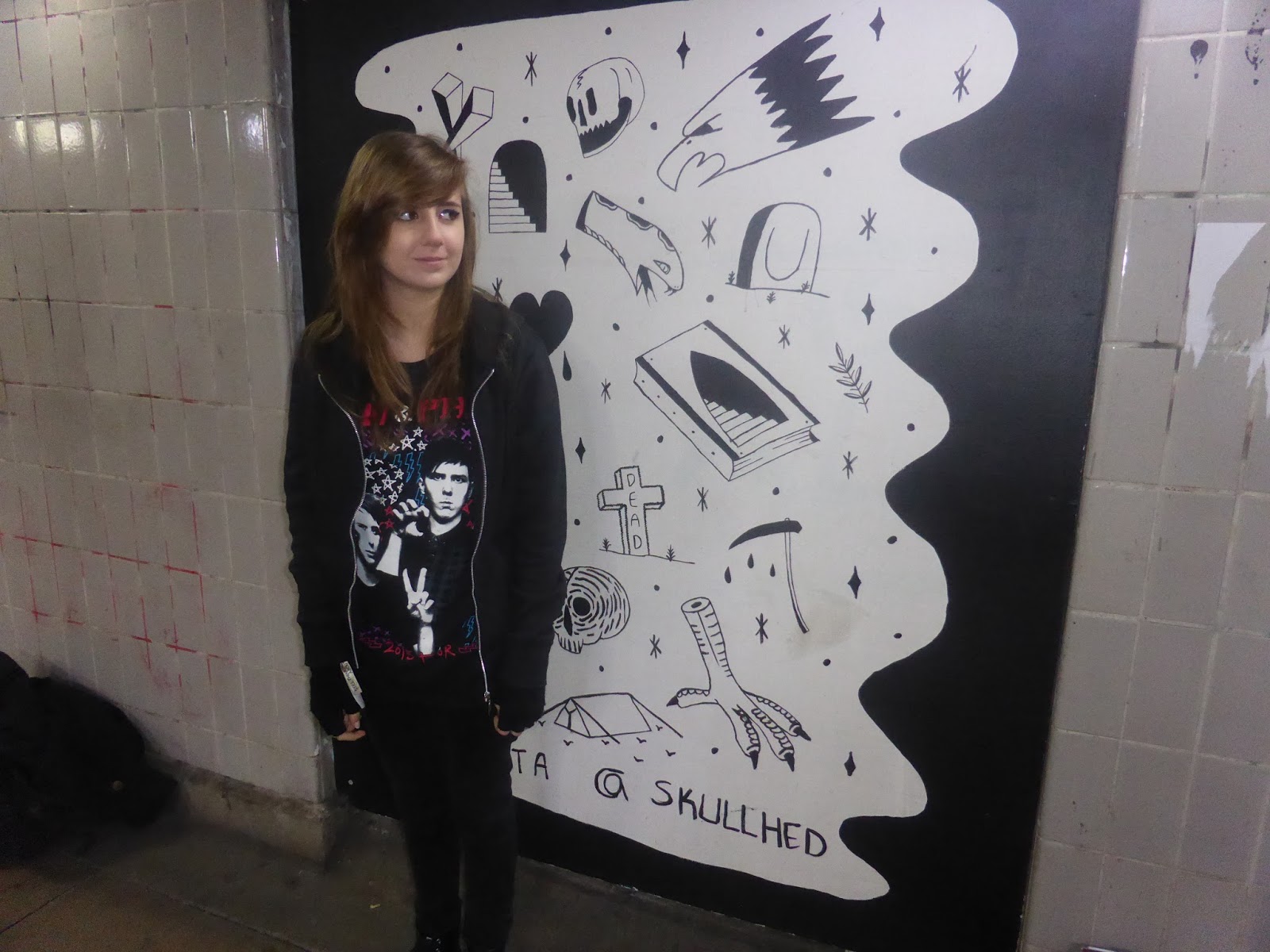
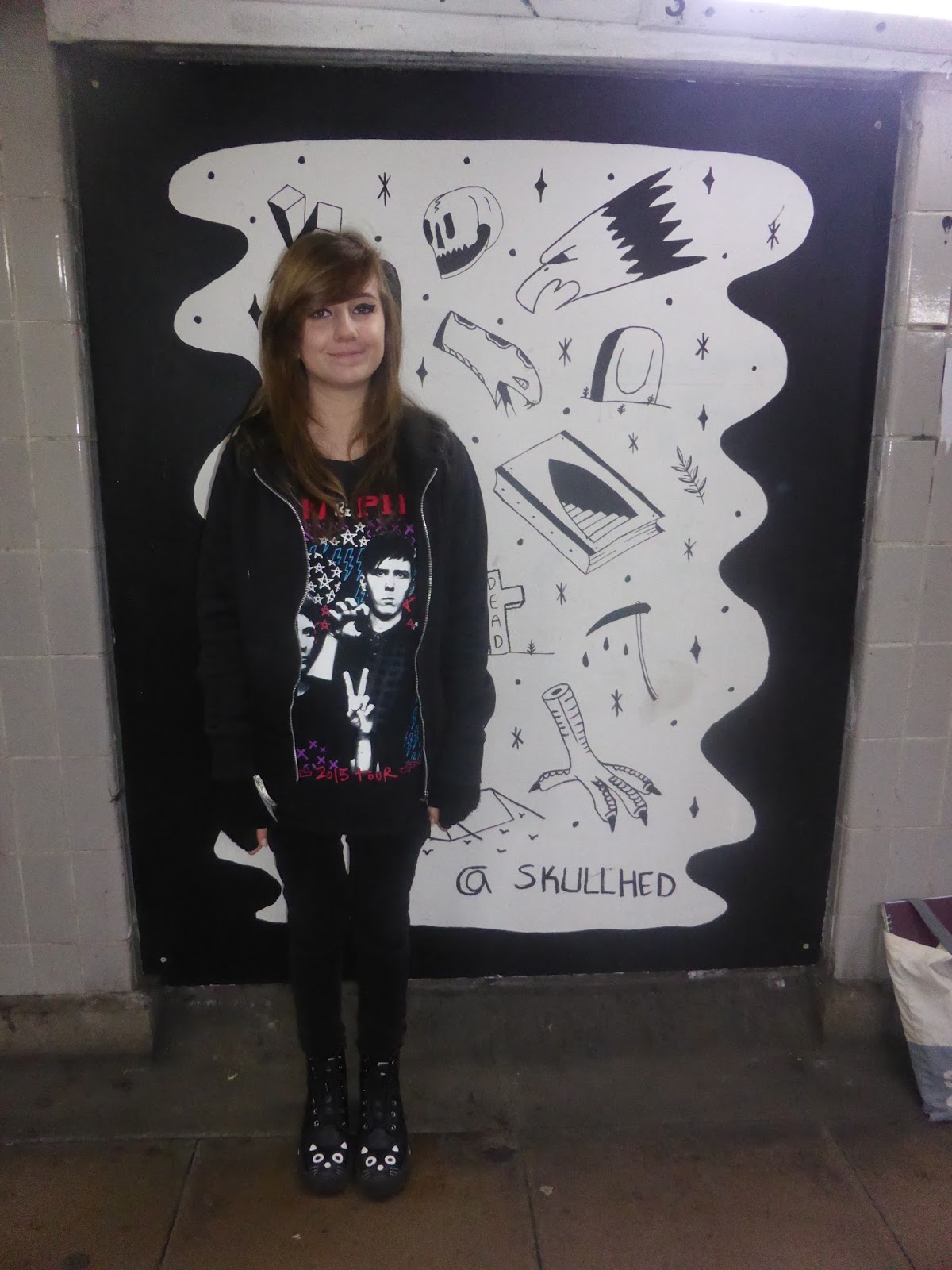
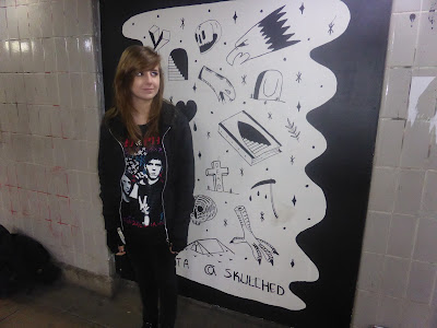
photo shoot took place in Norwich, on the 23rd November 2015 at
8:30am. I used Chaska Holden as the model and the photo shoot was to gather images for my cover story, so I had to make sure I took a variety of photos
which I could use on my front cover, contests page and double page spread.
These are the four photos I have chosen to use for my front
cover, contents page and double page spread. One of the reasons I have chosen these photos is because like the backgrounds to them all. The first photo has an empty background, this makes it good to use on the front cover as I will be able to put a masthead, cover lines and puffs in place so they will be able to be seen clearly. It is also mainly black which links to my chosen genre of music. The other photos have exciting backgrounds which will link to the design of my magazine. The cartoon illustrated images and graffiti act as an interesting background, but don't take focus off the artist in the image. My model represents the genre of my music magazine through her clothing, make up and hair style. The clothing and make up are black which, stereo-typically is the main colour associated with the rock genre of music. This is one way my target audience will know and be able to relate to my magazine. The model is using direct mode of address which engages the audiences attention and gives the her power and control.
Front Cover Photo
Contents Page Photo
Double Page Spread Photo
The second photo shoot took place
in Horstead on the 21st December at 2.00pm. This photo shoot was to
gather extra photos which I could use on my contents page. The model I used was
Eddie Vickers and the photos link to the article on page 22 in the features
section of my magazine. It is important for me to include a variety of images
on my contents page as it balances out the large amount of text and makes the
page look more exciting and will engage my target audience. It also shows the
reader that there is a lot of content in the magazine and that they are getting
their monies worth.
This is the photo I have decided
to use on my contents page. I have chosen to use this photo as it is a long
shot which shows most of the artist’s body. I really like the close up photos I
took in this photo shoot however, I thought it would be better to use a long
shot as I am already using a close up shot on the contents page and having
different types of photo will make the page look more interesting. I choose to have an empty brick wall as the background as this draws the readers attention to the artist. The brick wall background also makes it obvious that the photo has been taken outside which links to the text on the contents page which says, 'Find out what Eddie Lee has been up to on his recent visit to the UK'. Both the outdoors image, and text imply that the artist has been out and about and busy which gives the impression that the article will be an interesting one to read. The clothing worn by the artist is stereo-typically associated with the rock genre and the subcultures surrounding rock.This is because they are all darkly coloured. The artist also has black hair which can also be associated with alternative genres of music. I like that the artists shirt is blown open as this gives a clear view of the chain hanging of the trousers which again is something only expected to be seen in alternative cultures. The artist having his legs apart and arms either side of him makes his pose look powerful and controlling. This is also helped by the smirk on his face and direct mode of address as this creates an impressive and commanding image. All of these present the artist as quite tough and authoritative which is what is socially expected of rock musicians.
Contents Page Photo
Other photos I have included in my music magazine:
This is a photo I have taken on the 11/10/15 at the SSE London Wembley Arena at a concert I attended. I decided to include this photo on my contents page as it creates a variety of images for my reader to look at, and makes my page more interesting and engaging.
Saturday, 7 November 2015
Pre-Production Planning: Flat Plans
I created flat plans of my front cover, contents page and double page spread on Indesign. I based all of my flat plans on my initial sketches which illustrate how I first imagined my music magazine to look. I have used place holder text and boxes with crosses through them to represent where the text and images would be. Using place holder text and marking out the placement of photos helps to create a better overall image of how my music magazine will eventually look.
Front Cover
Double Page Spread
Subscribe to:
Posts (Atom)