
Showing posts with label Construction. Show all posts
Showing posts with label Construction. Show all posts
Tuesday, 5 January 2016


Final Music Magazine (presented through Issuu)
I have presented my final music magazine pages through Issuu. This allows me to see how my music magazine would actually look if it was made available either digitally or if it was printed. I also included an appropriate advert on the reverse of my front cover, before my contents page. The advert is for a music festival which is taking place in the UK, (where my music magazine would be published). The advert is relevant as the festival it is advertising is a rock music festival which matches the genre of my music magazine. Also, the headlining band of the festival is mentioned on my front cover, and in my contents page.
Monday, 4 January 2016
Images:
This is the bar code I am using on my front cover. I will add a date and a price to it which is appropriate to my music magazine.


I will also include social media logos on my contents page. This shows my audience how to keep in contact with the magazine. My research showed me that the three social media sites I choose were the ones most frequently used my y target audience. I used Twitter, Instagram and Facebook.


Development of my Magazine
I have shown the development of my music magazine pages by comparing the initial sketches, the flatplans, and the final pages which I created. By doing this I have found that mostly, my flatplans follow the design on my initial sketches very closely. The reason my final pages don't completely follow my plans is because it is difficult to tell too how something will look before it is made. Any decisions I made in my final magazine pages which were not planned was because the idea either didn't work or did not look good so I changed it.
Front Cover


Contents Page


Double Page Spread


Front Cover


Contents Page


Double Page Spread


Wednesday, 30 December 2015
Constructing my Double Page Spread:
I created my double page spread using Indesign and started off by following the flatplan of how I initially wanted my dps to look. I added both the photo's I had previously edited and then the title. I used the same font for my title and pull quote as the font on my front cover as this looks professional and shows clearly that the front cover and article on the dps are linked.I then copied the text from my interview on to the first page however, the whole article would not fit so I had to cut it down slightly. I still kept the introduction and conclusion to the interview as they are important parts of the article and the dps. In my introduction and conclusion I put the name of the band, the artist and the bands official website in bold. I also did this when I mentioned the bands album, but I also put this in italics. This is because they are important parts of information and need to be made obvious to the magazines audience. My article took up the whole first page of my dps, so I got rid of the smaller photo I planned on using. I made sure to include folios and that they matched the contents page, as well as adding a credit line. I mainly used a black and white colour scheme but also changed the question and answer colours to make it obvious what the artist said, I used the same red and blue that I used on my front cover as this shows the magazine follows a general house style.
First finished double page spread:


First finished double page spread:


I thought that my dps looked a bit simple, so to make it more exciting and to follow the theme more, I added bars of black to the edge of each page and added some more explosion graphics behind the text.
Final finished double page spread:


Constructing my Contents Page:
My initial finished contents page:

My first experiment adding red to the text:

I quite like how this looked, but I decided to experiment with the text looked if it was red and outlined in black instead.
My second experiment adding red to the text:

I liked how my headings looked in both of my experiments, so I decided to combine them for my final completed contents page. I used the red text outlined in black for all of the headings, apart from the 'welcome' at the top of the magazine introduction which I decided looked better against the grey if it was black and outlined in red.
My final contents page with added red to the text:
Constructing my Front Cover:
This shows my front cover with my edited image, bar code, banners, masthead, and graphics. I edited the image using Photo Shop and also used Photo Shop to create and my masthead and graphics. The lightning bolts on my front cover match the sound wave like lines on my masthead and makes the theme obvious. It also helps to represent my genre through the stereotype that rock music is loud and violent.

I then added the text to my banners.I choose the font on my larger banner as it fits well with explosion styled graphics. I can then continue this font on my double page spread to clearly show they are linked as they will follow the same theme. The font on my smaller banner at the bottom of the front cover follows the front cover theme as it uses the same colours. I also decided to use this font on the contents as this creates an obvious link between the front cover and the contents page of my music magazine.

Here I have added the date and price to my bar code, I have also added the rest of my cover lines. I decided the price of my music magazine should be £2.10 as my target audience research showed me that this would be a good and affordable price for a fort nightly music magazine. Each cover line between the lightning bolt graphics relates to an article inside that magazine. They are simple and to the point so that my target audience know what to expect. The cover line above my main headline/banner is a small introduction to what the main article will be about and is a font which links with the 'carton style' graphics.

The final part I added to the front cover was the puff. I hand designed it and then opened it it Photo Shop to edit the colour and size so that it would look good and clearly stand out against the rest of the front cover. The colours don't match the rest of the colour theme on the front cover as I wanted it to really stand out. However, I used red and yellow on my contents page so that the puff doesn't look completely out of place.
Tuesday, 29 December 2015
Early Construction of Front Cover:
Here are some early experiments of my front cover. I started off by following my flat plan designs but experimented with how I could place my masthead, cover lines and bar code to have the best effect. In these experiments I didn't like the placement of my masthead as it covered up too much of my artists head. In these experiments I also think that the cover lines were too big and took up too much room on the front cover as they had too many words. When I made my final front cover I made sure that the masthead was smaller and and that the cover lines were more to the point so that they would also be smaller which would allow me to have more room to add more cover lines and a puff.


Saturday, 21 November 2015
Signature Construction:
Before placing my 'magazine signature' on my contents page, I used Photo Shop to get rid of the white background and make the writing darker so that it would stand out clearly and be easy to read. This makes it obvious to the audience what it is.


Puff Construction:

Tuesday, 17 November 2015
Graphics Construction:
'Lighting Bolts' Graphics created in Photo Shop based on hand drawn designs:

'Explosion' Graphics created in Photo Shop based on hand drawn designs:


'Explosion' Graphics created in Photo Shop based on hand drawn designs:


Masthead Construction:
I created my masthead by scanning my hand drawn design into Photo Shop and then editing it so that it was the right colour and size so that it would be appropriate to my chosen genre of music magazine, rock.
After experimenting with different colours, I decided that I wanted to make my masthead red as this is a colour which is stereo-typically associated with rock related genres. I experimented with fading different shades of red together on my masthead as this would make it more exiting than just having one colour. I originally decided to make my masthead one layer but later decided it looked better with a shadow. This made my masthead stand out much more and looked a lot better on the page. Adding a shadow also gave me the opportunity to add more colours to my theme. I decided to use the colour blue as this matched the blue in the background of my photo and gave the masthead a three dimensional edge.
My first masthead:
 My final masthead design:

After experimenting with different colours, I decided that I wanted to make my masthead red as this is a colour which is stereo-typically associated with rock related genres. I experimented with fading different shades of red together on my masthead as this would make it more exiting than just having one colour. I originally decided to make my masthead one layer but later decided it looked better with a shadow. This made my masthead stand out much more and looked a lot better on the page. Adding a shadow also gave me the opportunity to add more colours to my theme. I decided to use the colour blue as this matched the blue in the background of my photo and gave the masthead a three dimensional edge.
My first masthead:


Monday, 16 November 2015
Edited Photos:
I planned my photo shoot so that the photos I took were how I intended them to look in my magazine. This meant I wouldn't have to edit them too much. Out of the all the photos I decided to use I only needed to edit four of them slightly so that they would be appropriate to use in my music magazine.
This is the photo I used as my front cover image. The only editing I have done to this image is make the shirt black instead of having the coloured pattern. This is because the colours on the shirt don't match the colour scheme of my front cover which makes the shirt look out of place.


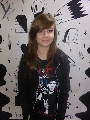


This is the photo I used as my front cover image. The only editing I have done to this image is make the shirt black instead of having the coloured pattern. This is because the colours on the shirt don't match the colour scheme of my front cover which makes the shirt look out of place.


This is the photo I used on my contents page. The only adjustments I made to this photo was taking away the writing at the bottom of the street art on the background as it has nothing to do with my musician or the article.


This is the photo I used on my double page spread. The only editing I made to this photo was again taking away the colours on the shirt as as they did not match the colour theme of the double page spread. I also cropped it to the correct size that it would fit on my double page spread.


The final photo I edited I didn't use on my double page spread as I ran out of room. The only editing I did to this photo was getting rid of the text at the bottom of the street art in the photo and cropping the image to get rid of the unwanted background so that the only visible parts were the musician and the street art.


Friday, 11 September 2015
Test Post

Subscribe to:
Posts (Atom)