Showing posts with label Planning. Show all posts

Tuesday, 24 November 2015

Pre-Production Work: Interview

This is the interview I will be including on my double page spread of my music magazine. The interview may have to cut down when I put it on my double page spread as it is quite long. I intend to ask questions about the bands recent success which I hinted at on my contents page, as a preview to what that particular magazine article is about. I don't have an exact plan of questions as each following question will depend on the response I get from the last question. My goal for the interview is to find out about the bands story of how they became famous and how the band feel about their success. 

My Interview: 


Hey, Chaska! We all know that QAR hit the road to fame since the release of your latest album, (Smash Fight) but can you tell us a little about the bands history before you got famous?

Hey! I formed Queen Anne’s Revenge back when I was 15 and in high school. At the time it was just a creative outlet for me and my friends Dan and Phil (drums and lead guitar) to relax and have fun. We were under a lot of pressure around the time the band formed from our school with exams, but this was just for us to forget about all that and focus on something fun for a bit. We only ever played covers of bands like Green Day and Fall Out Boy but we really enjoyed ourselves at the time!

So you started the band in high school? Now a few years later you’ve all recently finished college just last year, but quite a lot has changed since then. What happened between the time you formed in high school and now being world famous rock stars?

During our extended summer after finishing school we continued to play covers and we stated to meet up more regularly than before. It was at this point that I realised since our staring days we’d actually all bonded extremely well as a band an actually sounded pretty good! This was reinforced when the owner of our local pub asked us if we wanted to play a half an hour slot at a mini summer festival, and we of course said yes! We loved every second of our performance and the audience seemed to actually have just as much fun as we did!

Was it this performance which lead to you starting to support bands at local venues?

Yes, it was. At this time, we only had a drummer, guitarist and vocalist so we weren’t really in the best position to be playing proper live gigs. However, after our performance at the pub, a local guy who watched us and really enjoyed our set asked if we were looking for a bassist. We took this guy on trial and we all got along really well! This guy was of course, Chris who is now the bassist of the band today! Now that we had a full line up we really put 
in the rehearsal hours and started to apply for local support slots.

How was the experience supporting at local small venues in your home city?

Well, it turned out it was harder than we had first thought! It was a completely different atmosphere to the small pub show we had done, the difference being our small audience was actually made up of committed rock fans who would be properly judging us and not just out to hear a bit of live music. Playing covers is always difficult, because you want to get the crowd warmed up, and if they know the songs then its great and they’ll sing along. But sometimes really committed fans of bands don’t appreciate covers and can be quite critical.

So you hit a few rough patches whist first supporting?

Oh yes definitely! I think that every band has some bad first time experiences. One which will always stick out to me was the time we played a 20-minute support slot in Norwich. We played all our best covers with our own twist but we actually received pretty bad feedback from our audience. People told us they didn’t like our versions of the songs. We all left that gig feeling a little bit disheartened but that’s when the realisation hit me. That we should attempt to write our own songs, in our own style of music which we liked!

So this was when the true birth of QAR took place?

You could say that yes! We all sat down and had a chat about seriously trying to write our own music, it was quite a big commitment but we decided to give it a shot and spent a lot of last year trying to write our own songs. This was when Chris (bass) got into contact with an old friend of this who used to play guitar in his own band. He came along to some of our writing and rehearsal sessions and just never left! This of course in PJ who is are fifth member and rhythm guitarist!

So at this point you had all of you line up and had begun writing your own music? What next?

Well, once we felt confident again we went back to supporting at local gigs and we got an even better response from the audience than ever before! We now played a mix of our ow music as well as still a couple of covers. It was at this point that we started to get a bit of local recognition and were even asked to tour with some other small bands who we’d been friends with and supporting since we began playing gigs.

How did this lead to the release of your album Smash Fight?

After our tour at the beginning of summer we were asked by a local independent recording studio if we would be interested in recording an album! We were delighted that somebody had enough faith in us and our own music to record an actual album!

You released Smash Fight in November last year, and now its January and you’re one of the most successful rock bands today, how did this happen exactly?

After releasing the album, we promoted it as much as possible on our social networking sites. Our small fan base all responded amazingly to the album and somehow within a week we had a massive following. One of our fans tweeted Alex Gaskarth of All Time Low with a link to our album telling him to listen to it, and he did! He them tweeted about us and a lot of the All Time Low fan base listened to, and loved our music! It was after this that more people across the internet started to hear the name Queen Anne’s Revenge and listen to us. Somehow in the space of a view days we had gone from being an unknown local group 
to an internationally famous band!

Now that you’ve come this far, do you consider yourself to be a rock and roll legend?

Hahaha I wouldn’t go as far to say that! Not yet… hahaha. But it does feel incredible to have our music out there for a wider audience to enjoy. I think that one day I’d love to be able to have the same influence on my audience as one of my own inspirations had on me, Haley Williams of Paramore.

It’s been great talking to you Chaska! Do you have any final words to your audience, or to anyone who was in a similar position to yourself?


I’ve just got to say a massive thank you for all the lovely words of appreciation from everyone who has listened to the album! And if you ever feel like it’s too difficult to get into the music industry, whatever you do, do not give up! Just keep doing what you enjoy and one day you’ll dreams will come true in a similar to how ours have!


Pre-Production Work: Contents Page

I decided that a reasonable price for my rock music magazine, Amplified, would be £2.10. This because my audience research showed me that my target audience would be happy to pay between £1.00 and £3.99 for a weekly magazine, so I decided that £2.10 for a fought nightly magazine was a very good and affordable price. I think, that for £2.10, I have included lots of content and my target audience readers will get their value for money. 

Articles which will appear on my contents page:

FEATURES
ON THE COVER: Rising stars, Queen Anne’s Revenge (16) Chaska Holden of QAR spills the beans on the bands sudden rise to fame, and what inspired her to follow her dreams of becoming a rock legend.

That’s all before we look back on the greatest Rock Legends of 2015 (18)

as well as find out what Eddie Lee has been up to on his recent visit to the UK. (22) 

Fearless Vampire Killers take the Pointless Quiz (10)

And we look at the top 10 best album artworks of all time as voted by you (12)

NEWS
ON THE COVER: Reading Line up 2016 (4) We dissect the recently announced acts for the Reading 2016 line up so far and predict who else will be playing this year!

Good Charlotte to announce reunion tour? (7) It’s been 4 long years since Good Charlotte split back in 2011, but now they’re back and we’ve heard rumors of a new album and a celebration tour.

Pvris and Lower Than Atlantis join forces once again (9) as Lynn Gunn appears as guest vocalist on the latest LTA single.

The return of Paramore (14) after the sudden departure of Jeremy at the end of last year, Paramore have announced they are back, and stronger than ever.

POSTERS
Six fantastic shots featuring: Fall Out Boy, Green Day, Queen Anne’s Revenge, Mallory Knox, Muse and Blink-182 (24)

REVIEWS
Amplified got an exclusive listen to new Panic! at the Disco album, Death of a Bachelor to be released January 15th - it doesn’t disappoint (30)

Exclusive past and present ultimate album review (32)

The best merchandise in rock (34)   

LIVE SHOWS
What happened when Fall Out Boy hit Wembley

and Foo Fighters played a secret show? (36)

GIG GUIDE

ON THE COVER: Ray Toro Solo Tour - newly released tour dates from the ex-MCR guitarist. 

And all the upcoming gigs you NEED to know about (38)

Saturday, 21 November 2015

Hand Drawn Type Face

On my contents page, I decided to include an introduction to the issue of my music magazine. I finished the paragraph with 'Team Amplified', as if signing off a letter to my target audience who are reading my magazine. To make the message more personal, I decided to also hand sign the introduction paragraph. This will make the reader feel more connected to the magazine and could help to encourage them to buy it again in the future. 

Hand written signature designs:


My chosen hand written signature to put on my contents page:


I choose this design to include on my contents page as it is easy to read, and has clearly been written by hand. I also particularly like the little lighting bolt I included as it matches the magazines theme on the front cover. 

Hand Drawn Graphics

I decided to hand design a puff for my magazine front cover. My intention was to create a 'stamp like' puff with the purpose of it to inform the magazine readers that the main cover story is exclusive to Amplified. This makes the story on the front cover seem more exciting and interesting and will encourage my target audience to buy, it as they know they won't be able to read the interview anywhere else. 

My hand drawn puff designs:


My puff design I choose to include on my magazine front cover:


I choose this design because out of all my designs this one resembles a stamp/seal shape the most. I like that the puff looks like a seal as they tend to be found on important documents and letters. This then enforces the idea that this article is of extreme importance and will encourage it to be bought by my target audience. I will edit the colours on Photoshop so that it stands out on my front cover.


Tuesday, 17 November 2015

Pre-Production Work: Hand Drawn Graphics

I decided that I would like to include lighting bolt shapes on my front cover to divide my cover lines, I think that lighting bolts are a good idea as they match the style of my masthead and follow my theme of sound waves and amplifying music. I also decided that I would like to include explosion type graphics on my front cover and double page spread which to make my cover story exciting. The explosion fits with the theme of the article and interview as it is about a new rock band who have come out of no where and become famous, similarly to how an explosion starts off as nothing and gets bigger. When drawing both of these I intended on scanning them into Photo Shop and editing them to give them a cartoon feel. 

'Lightning Bolt' Drawing


'Explosion' Drawing


Monday, 16 November 2015

Pre-Production Work: Masthead Designs

I decided that a suitable name for my rock music magazine would be 'Amplified'. I decided on the name, 'Amplified' as it has connotations of loud music, which is often a factor stereotypically associated with rock related genres of music. Also, rock music can be typically associated with lots of guitar sounds and to be heard properly, guitars need to be connected to amplifiers. Other names I considered for my rock music magazine included, 'Music Pick', which is based on guitar picks used by musicians and 'Loud!', as rock music is generally assumed to always be loud. I decided to use 'Amplified' however, as I think it sounds the best and most professional as well as has a deeper meaning which is linked to rock music. 

Initial Hand-Drawn Masthead Designs:

I experimented with serif and sans-serif influenced typography for my potential magazine masthead designs. 


I then experimented with different ways to present my masthead. Each one of these illustrations represent the idea of amplifying, and making noise louder. I experimented with the idea of sound waves, strings of a guitar snapping, an explosion and an input lead which connects instruments to amplifiers. 


After this I combined my favourite masthead typography and favourite masthead backings together to see which designs looked best. 


I like how my experiments turned out, and I particularly like the additions I added to the line running through the top masthead experiment, as this illustrates sound waves actually being amplified. Making the lines more pointed and jagged fits the 'rock image' more than the curved lines as they are harsher and heavier and firm compared to the soft gentle curved lines. I then decided that I would combine the amplified line backing to the third masthead typography experiment instead of having the explosion. 


I really like how this design looks and have decided to use it as the masthead for my rock music magazine. 


Friday, 13 November 2015

Photo Shoot

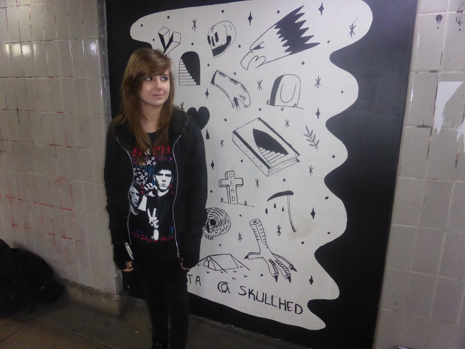
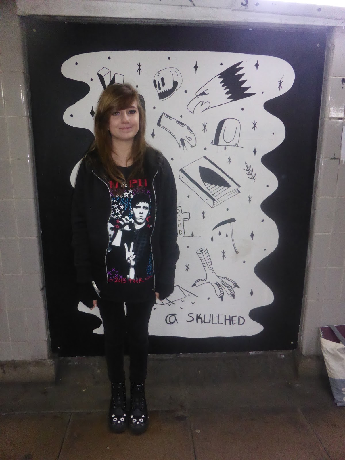
I organised two photo shoots which allowed me to gather enough of my own images to put together a successful music magazine. The first photo shoot took place in Norwich, on the 23rd November 2015 at 8:30am. I used Chaska Holden as the model and the photo shoot was to gather images for my cover story, so I had to make sure I took a variety of photos which I could use on my front cover, contests page and double page spread.


These are the four photos I have chosen to use for my front cover, contents page and double page spread. One of the reasons I have chosen these photos is because like the backgrounds to them all. The first photo has an empty background, this makes it good to use on the front cover as I will be able to put a masthead, cover lines and puffs in place so they will be able to be seen clearly. It is also mainly black which links to my chosen genre of music. The other photos have exciting backgrounds which will link to the design of my magazine. The cartoon illustrated images and graffiti act as an interesting background, but don't take focus off the artist in the image. My model represents the genre of my music magazine through her clothing, make up and hair style. The clothing and make up are black which, stereo-typically is the main colour associated with the rock genre of music. This is one way my target audience will know and be able to relate to my magazine. The model is using direct mode of address which engages the audiences attention and gives the her power and control. 

Front Cover Photo 

Contents Page Photo

Double Page Spread Photo 


 Double Page Spread Photo 

The second photo shoot took place in Horstead on the 21st December at 2.00pm. This photo shoot was to gather extra photos which I could use on my contents page. The model I used was Eddie Vickers and the photos link to the article on page 22 in the features section of my magazine. It is important for me to include a variety of images on my contents page as it balances out the large amount of text and makes the page look more exciting and will engage my target audience. It also shows the reader that there is a lot of content in the magazine and that they are getting their monies worth. 


This is the photo I have decided to use on my contents page. I have chosen to use this photo as it is a long shot which shows most of the artist’s body. I really like the close up photos I took in this photo shoot however, I thought it would be better to use a long shot as I am already using a close up shot on the contents page and having different types of photo will make the page look more interesting. I choose to have an empty brick wall as the background as this draws the readers attention to the artist. The brick wall background also makes it obvious that the photo has been taken outside which links to the text on the contents page which says, 'Find out what Eddie Lee has been up to on his recent visit to the UK'. Both the outdoors image, and text imply that the artist has been out and about and busy which gives the impression that the article will be an interesting one to read. The clothing worn by the artist is stereo-typically associated with the rock genre and the subcultures surrounding rock.This is because they are all darkly coloured. The artist also has black hair which can also be associated with alternative genres of music. I like that the artists shirt is blown open as this gives a clear view of the chain hanging of the trousers which again is something only expected to  be seen in alternative cultures. The artist having his legs apart and arms either side of him makes his pose look powerful and controlling. This is also helped by the smirk on his face and direct mode of address as this creates an impressive and commanding image. All of these present the artist as quite tough and authoritative which is what is socially expected of rock musicians.  

Contents Page Photo

Other photos I have included in my music magazine:


This is a photo I have taken on the 11/10/15 at the SSE London Wembley Arena at a concert I attended. I decided to include this photo on my contents page as it creates a variety of images for my reader to look at, and makes my page more interesting and engaging.


Saturday, 7 November 2015

Pre-Production Planning: Flat Plans

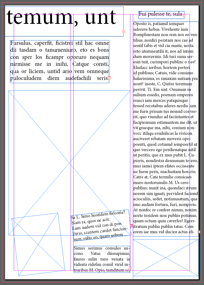
I created flat plans of my front cover, contents page and double page spread on Indesign. I based all of my flat plans on my initial sketches which illustrate how I first imagined my music magazine to look. I have used place holder text and boxes with crosses through them to represent where the text and images would be. Using place holder text and marking out the placement of photos helps to create a better overall image of how my music magazine will eventually look. 


Front Cover

Contents Page 


Double Page Spread 


Friday, 6 November 2015

Press Release

Pre-Production Planning: Initial Sketches

Initial Sketches 

Here are some sketches I have done to illustrate my initial ideas for the layout of my front cover, contents page and double page spread of my music magazine. I will base my flat plans on these sketches. 

Front Cover:


Contents Page:


Double Page Spread: 


Friday, 11 September 2015

Test Post

This is a magazine I buy often as it has interesting and funny articles about bands I listen to. This particular cover has one of my favourite bands on the front which is why I like it so much! It uses bright colours in an interesting splash design around the members of the band which makes them stand out as well as having a nice layout which makes it is clear what else is in the magazine other than the cover story.