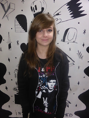
This is the photo I used as my front cover image. The only editing I have done to this image is make the shirt black instead of having the coloured pattern. This is because the colours on the shirt don't match the colour scheme of my front cover which makes the shirt look out of place.
This is the photo I used on my contents page. The only adjustments I made to this photo was taking away the writing at the bottom of the street art on the background as it has nothing to do with my musician or the article.
This is the photo I used on my double page spread. The only editing I made to this photo was again taking away the colours on the shirt as as they did not match the colour theme of the double page spread. I also cropped it to the correct size that it would fit on my double page spread.
The final photo I edited I didn't use on my double page spread as I ran out of room. The only editing I did to this photo was getting rid of the text at the bottom of the street art in the photo and cropping the image to get rid of the unwanted background so that the only visible parts were the musician and the street art.


No comments:
Post a Comment